%20(1)%20(1).png)

You're spending real money on ads. People are clicking. And your demo page is sitting at 2-3% conversion rate, quietly bleeding budget while your sales calendar stays empty.
Here's the thing: a SaaS demo page not converting is almost never a product problem. It's almost always a page problem: a weak headline, a form that asks too much, or a disconnect between where your visitors came from and what they see when they land. The good news is that all of these are fixable, and fixing them doesn't require a full redesign or a new agency.
This guide covers what's likely going wrong and exactly how to fix it.
The Most Common Reasons SaaS Demo Pages Don't Convert
Before you can fix the page, you need to know which problem you're solving. Most demo pages underperform for one of four reasons.
Low Clickthrough Rate from Your Homepage or Landing Page
Before your demo page can convert, people have to click on it. If your CTA is buried in the footer, tucked into the nav without emphasis, or sends mixed signals about what happens next, you're losing potential demos before visitors even arrive. The page isn't the problem, the path to it is.
Not Enough Traffic
Conversion rate is only part of the math. If your demo page is only reachable from a single button on your homepage, most of your site's traffic never sees it. Blog readers, pricing page visitors, and people coming in through retargeting are all potential demos.
Unclear Messaging
Visitors who aren't sure what they're signing up for don't sign up. If your demo page doesn't immediately answer "what actually happens when I submit this?" most people will close the tab. Ambiguity kills conversions.
To write clearer messaging, check out our guide on 12 SaaS Demo Page Headlines That Actually Convert (With Analysis).
A Complicated Form
Every field you add to your demo form costs you leads. This has been tested across thousands of SaaS landing pages and the result is consistent. Shorter forms convert better. Most demo pages have at least two fields the sales team doesn't actually need.
How to Fix Low Clickthrough Rate to Your Demo Page
The fix here isn't on your demo page, it's everywhere else on your site.
Make Sure Your Sitewide CTA Points to the Demo
Check every CTA button on your site right now. If some say "Get Started," some say "Try for Free," and some say "Book a Demo," you're splitting intent. Pick the primary action, demo, in this case, and make it the dominant CTA across your homepage, pricing page, and high-traffic blog posts. Consistency tells visitors there's one clear next step.
Then check placement. The demo CTA should be above the fold on your homepage, in your sticky nav, and at the end of any blog post that attracts problem-aware traffic. If someone has to scroll past three sections to find it, most of them won't.
How to Fix Not Enough Traffic to Your Demo Page
If your demo page only gets traffic from one button on your homepage, you're missing most of your site's audience. Here's where to add paths:
- High-traffic blog posts — add a contextual CTA midway through and at the bottom linking to the demo
- Pricing page — visitors here are already evaluating; a demo CTA is a natural next step
- Product features pages — visitors doing deeper research are often close to decision-ready
- Retargeting campaigns — past visitors who didn't convert are some of your highest-intent prospects
Traffic and conversion rate work together. Getting more of the right people to the page compounds every improvement you make to it.
How to Fix Unclear Messaging
When someone lands on your demo page, they should know in five seconds: what they're getting, who it's for, and what happens next.
Most demo pages fail this test. They lead with a generic headline — "See [Product] in Action" — and drop directly into a form. There's nothing between the ask and the answer.
Fix it by being explicit. Under your headline, tell visitors:
- What the demo actually covers (specific features, workflows, or use cases, not a generic "product tour")
- Who reaches out and when ("Your dedicated rep will email you within one business day")
- How long it takes ("30 minutes, no sales pitch, your agenda")
One concrete sentence of expectation-setting under your headline does the heavy lifting. "Get a 30-minute custom walkthrough of [Product] from a product specialist, tailored to your team size and goals." That's answerable. "See it in action" is not.
To write clearer messaging, check out our guide on 12 SaaS Demo Page Headlines That Actually Convert (With Analysis).
How to Fix a Complicated Form
Strip it down. Most demo forms ask for seven or eight pieces of information. Most sales teams need three or four to prepare for a call.
Start with what's non-negotiable: first name, business email, and company. Everything else is a gate between the visitor and the booking. Add fields back only if there's a specific reason, and test each addition against CVR before keeping it.
Form Best Practices
- Keep it to 3-4 fields maximum as your starting point
- Use a business email field (not any email) if lead quality matters more than volume
- Use form logic to qualify leads — a conditional dropdown for company size routes leads without adding friction for everyone
- Consider a scheduling tool (Calendly, Chili Piper) instead of a static form — letting prospects pick a time slot directly removes the "waiting to hear back" drop-off entirely
- If you want more fields, test a multi-step form — two short steps convert better than one long one, because people finish what they start
How to Build a High-Converting Demo Page
Once your traffic problem is fixed and your form is cleaned up, the page structure itself does the converting. Here's what the best-performing demo pages have in common.
Make Your Headline Clear and Specific
"Book a Demo" is not a headline. Tell visitors what they're actually getting. "Get a 30-Minute Custom Demo of [Product]" is better. "See How [Product] Helps [ICP] [Specific Outcome]" is better still. Specific always beats clever.
Tell Them What the Demo Covers
Three to four benefit-driven bullet points under your headline. Not feature bullets, outcome bullets. "How to reduce your sales cycle by 30%" outperforms "Walkthrough of all platform features" every time.
Tell Them How Long It Takes
"This demo takes 30 minutes", say it on the page. Time commitment anxiety is one of the most common reasons people don't book. Removing that uncertainty takes two seconds to write and costs you nothing.
Handle Objections Before They Surface
Survey your lost leads. Ask what stopped them from booking. The most common answer in B2B SaaS: fear of a hard sell. Counter it on the page. "No commitment required. No sales pressure. Just 30 minutes to decide if it's a fit." One line. One objection eliminated.
Add Proof That Actually Means Something
Logo banners are fine because they build baseline trust. But the demos worth studying pair logos with specific outcomes. A case study showing "Company X increased demo-to-close by 40% in 60 days" does more than a 5-star review quote. If you have the numbers, show them.

Let Them Book Directly
A scheduling tool beats a static contact form. When visitors can pick a time immediately, the commitment happens in the moment, there's no waiting, no "someone will be in touch" drop-off window. Calendly is familiar and frictionless. Use it.
Show an Exit Pop-Up
If a visitor is leaving without booking, meet them on the way out. An exit pop-up can offer a softer alternative, a free trial, a product tour, or a relevant resource. Not every visitor is ready for a demo. Keeping them in the funnel with a lighter ask still beats losing them entirely.
Test Your Form Length
There's no universal right answer on form fields, it depends on whether you want more leads or better leads. If volume is the priority, shorten the form. If quality is the priority, add a qualifying question and use logic to route accordingly. The key is to test, not assume.
Build Clear Design Hierarchy
Your demo page has one job: get someone to book. Every element that competes with that job reduces the likelihood it happens. Keep the visual hierarchy simple, headline, benefit bullets, form, social proof. Nothing else is competing for attention.
Remove the Nav and Footer
This is one of the highest-ROI changes on a demo page. Your navigation is an exit ramp. The footer is another one. Remove both. The only action a visitor should be able to take is book the demo. Removing nav alone can lift conversion on high-intent pages by 10-20%.
Run Experiments Consistently
No demo page is ever finished. The ones converting at 10-15% got there through testing headline copy, CTA text, form length, social proof placement, page layout. One test per month is a minimum. The compounding effect of consistent experimentation is where the real CVR gains come from.
Example Demo Pages Worth Studying
The best demo pages do most of what's on this list. Here are three worth looking at directly.
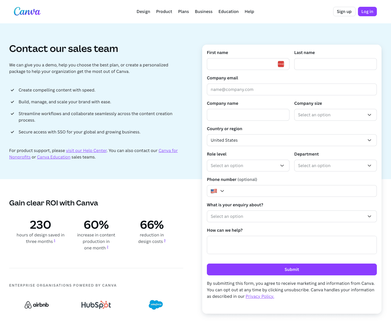
Canva (canva.com/contact-sales)
Canva's enterprise demo page sets the standard for expectation management. Under the headline, they explain exactly what you'll get from the demo and what ROI enterprise teams can expect. Social proof is logo-based with clickable case studies. The form is intentionally longer, Canva is filtering for enterprise leads only, not volume.
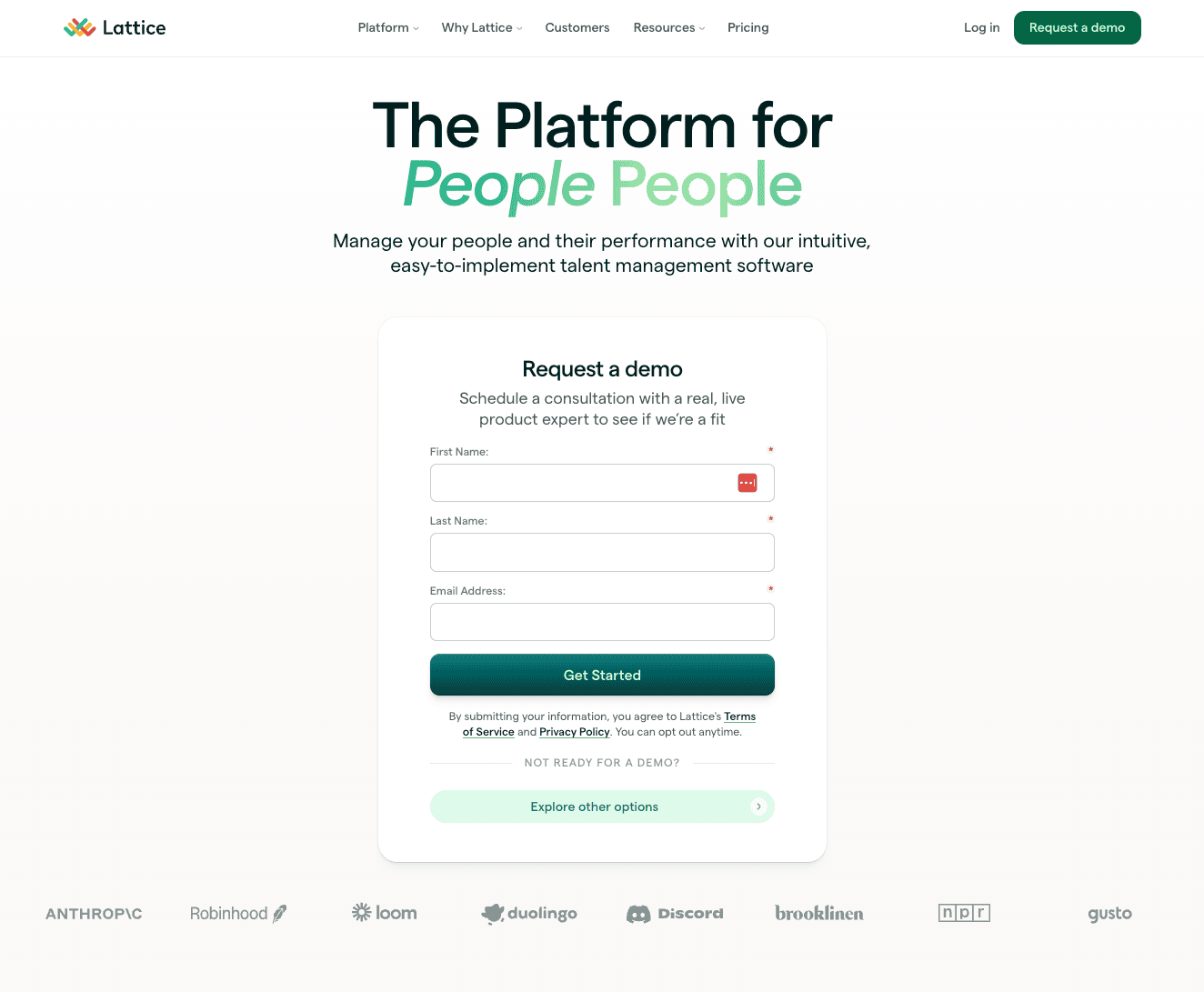
Lattice
Simple headline, outcome-focused bullet points, a three-field form, recognizable customer logos with platform review ratings, and an exit pop-up when you try to leave. Nothing flashy, just solid execution of the fundamentals.
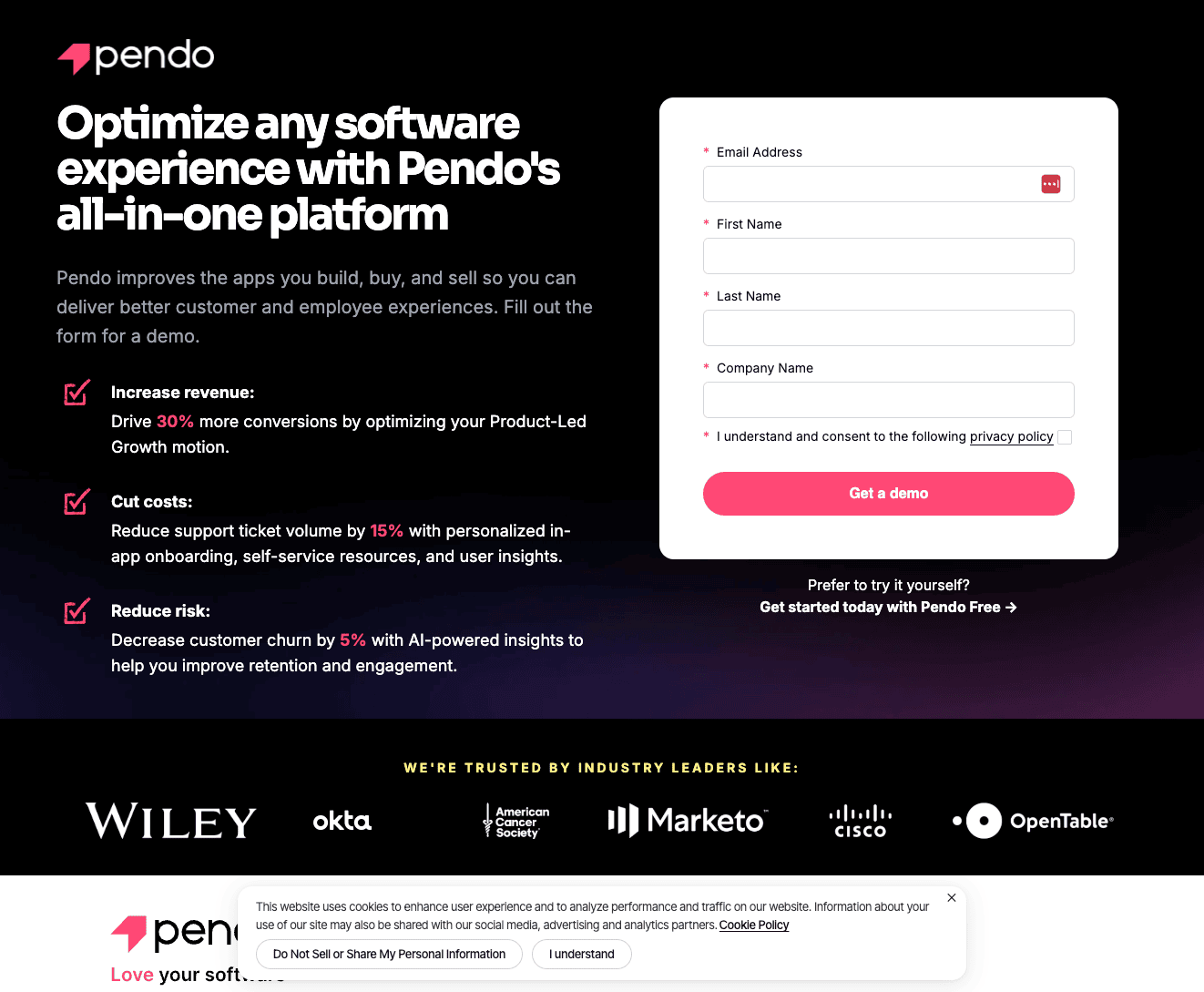
Pendo
Pendo uses a longer form deliberately because they want qualified leads over volume. They pair it with specific benefit bullets, big-brand logos, and an exit pop-up that offers a free trial as an alternative for visitors who aren't ready for a sales conversation. Multiple exit paths for different buyer stages.
How to A/B Test Your Demo Page
A/B testing your demo page is one of the quickest ways to get it to start converting better.
But a proper demo page test requires enough traffic to reach statistical significance before you make a call. If your page gets fewer than 500 visitors per month, run one test at a time and give it at least 30 days before drawing conclusions.
Setting Up the Test
Pick two headlines: your current headline and one challenger. Run them 50/50 using Mida.so. Keep every other element on the page identical. Change only the headline.
Your success metric is demo form submissions, not scroll depth or time on page. The only number that matters is whether someone completed the form.
What to Test First
Start with a Formula 1 headline against your current headline. The "outcome without objection" structure addresses the most common demo page drop-off reason — fear of a sales call — while still communicating value. It's the highest-probability challenger for most B2B SaaS demo pages.
Once you have a winner, move to the next variable. Headline first, then CTA copy, then form length. One change at a time.
For a step-by-step walkthrough of how to structure and run this test, watch this video:
Want 147 more tips like this? Get our free 148-point landing page checklist.
If your SaaS website is only converting at 1-2%, the problem is almost always fixable, and it's almost never your product. A cleaner layout, more specific headlines, and the right social proof can move you from 2% to 10% CVR faster than any ad campaign adjustment.
Get the free checklist here: https://www.fitrmedia.com/funnels/saas-sidekick