
How to set aspect ratios Webflow | Simple method
Learn the simple solution that you can use to make pixel perfect aspect ratios for your images that will maintain the set aspect ratio no matter how small or large the user's browser window is resized.

.png)
On the surface Webflow doesn’t offer an easy solution to creating image aspect ratios. However, don’t fret, because there is a simple solution that you can use to make pixel perfect aspect ratios for your images that will maintain the set aspect ratio no matter how small or large the user's browser window is resized.
What elements you’ll need:
- A container (Unless you’re using a grid)
- An image frame (div)
- An image
Step 1: Add a container
To start, you’re going to want to wrap your images inside some sort of container that has a max width set to it. The max width can be whatever you want, but keep in mind the max width that you set will be the max width for your image as well.
The only caveat here is if you’re using a grid. If you’re using a grid you won’t have to set a max width for each image since the grid will do that automatically.
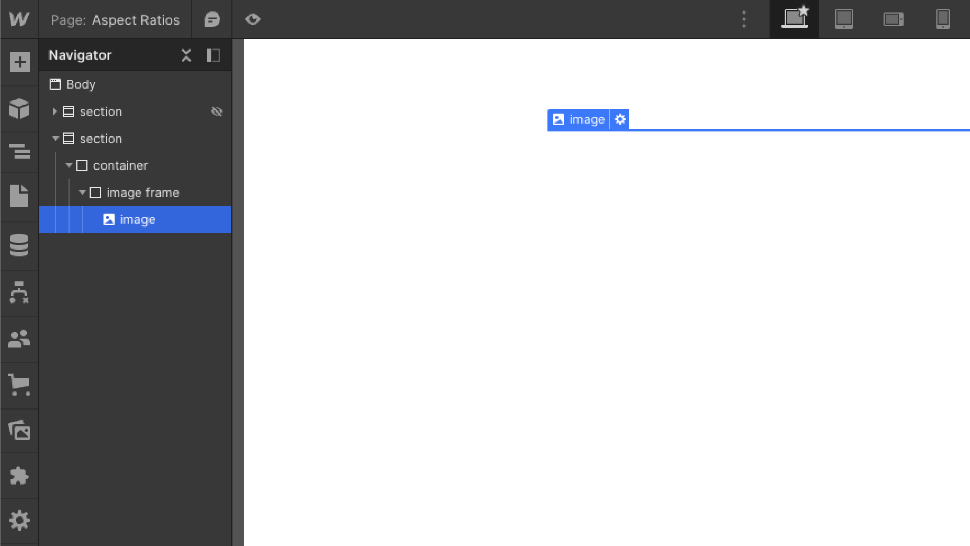
Step 2: Add an image frame and image
From here, we want to place a div inside of our container and give it a class “image-frame” or whatever you prefer. This div is going to act as the frame for the image. And then within the “image-frame” div, we're going to drop in an image and give it a class name of “image” or something similar.
This is how your hierarchy should look in the navigator for the elements we just added:
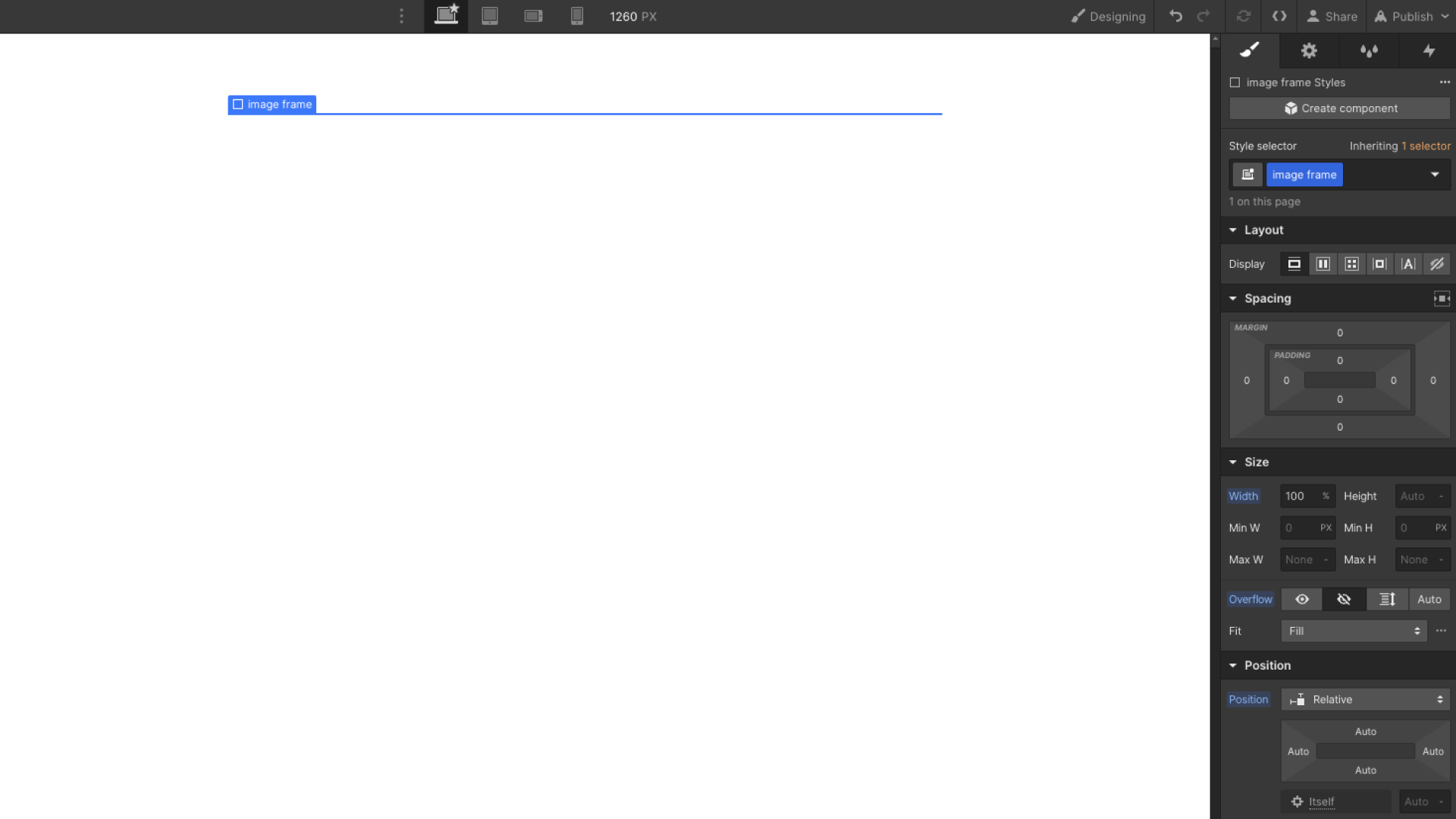
Step 3: Add styles
Now, we can start styling these elements to bring everything together. So for the image frame, here are the styles we need to set:
- Width: 100%
- Position: relative
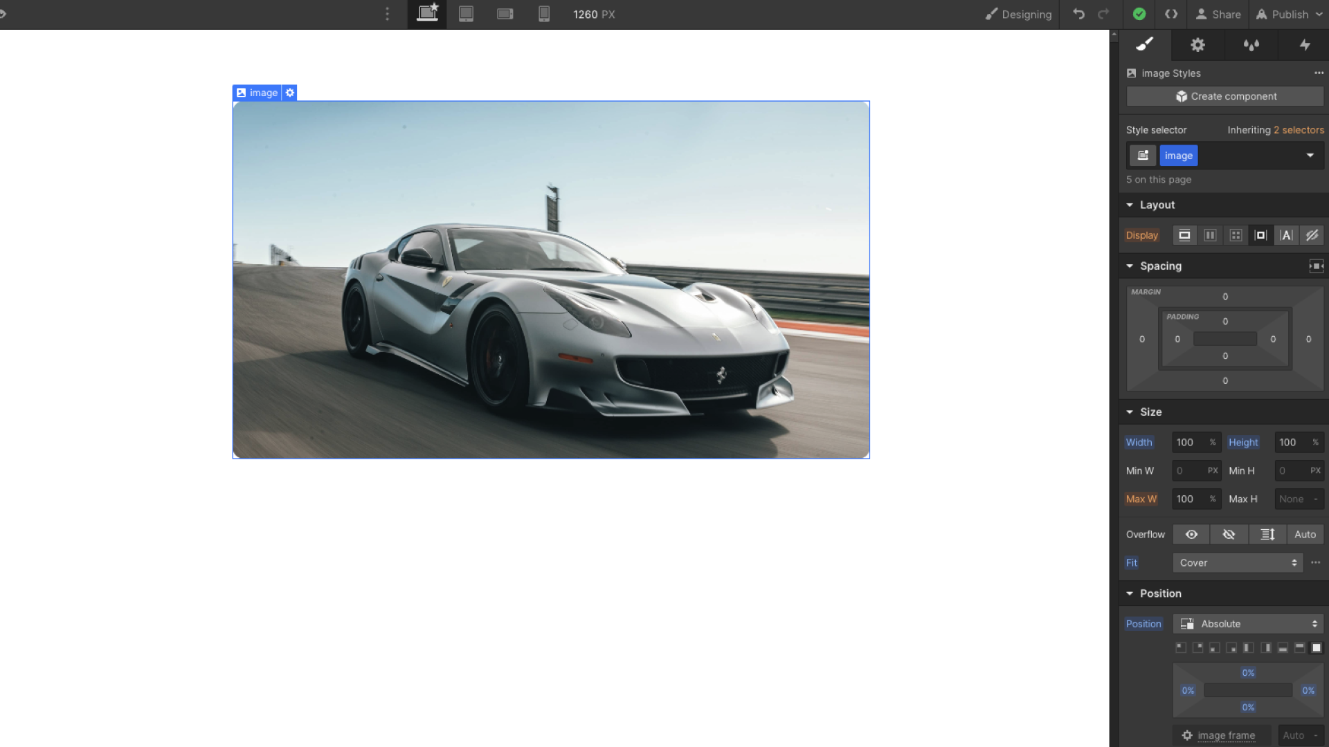
And then here are the styles we’ll need to set for the image:
- Position: absolute (Then set to full by clicking on the square)
- Width: 100%
- Height: 100%
- Set Fit to Cover
Step 4: Set aspect ratio
By now, your image should have disappeared. This is actually what we want since this is the part where we can start setting the aspect ratios.
With your “image-frame” selected, add 100% padding to the top. This will immediately give you a 1:1 aspect ratio.
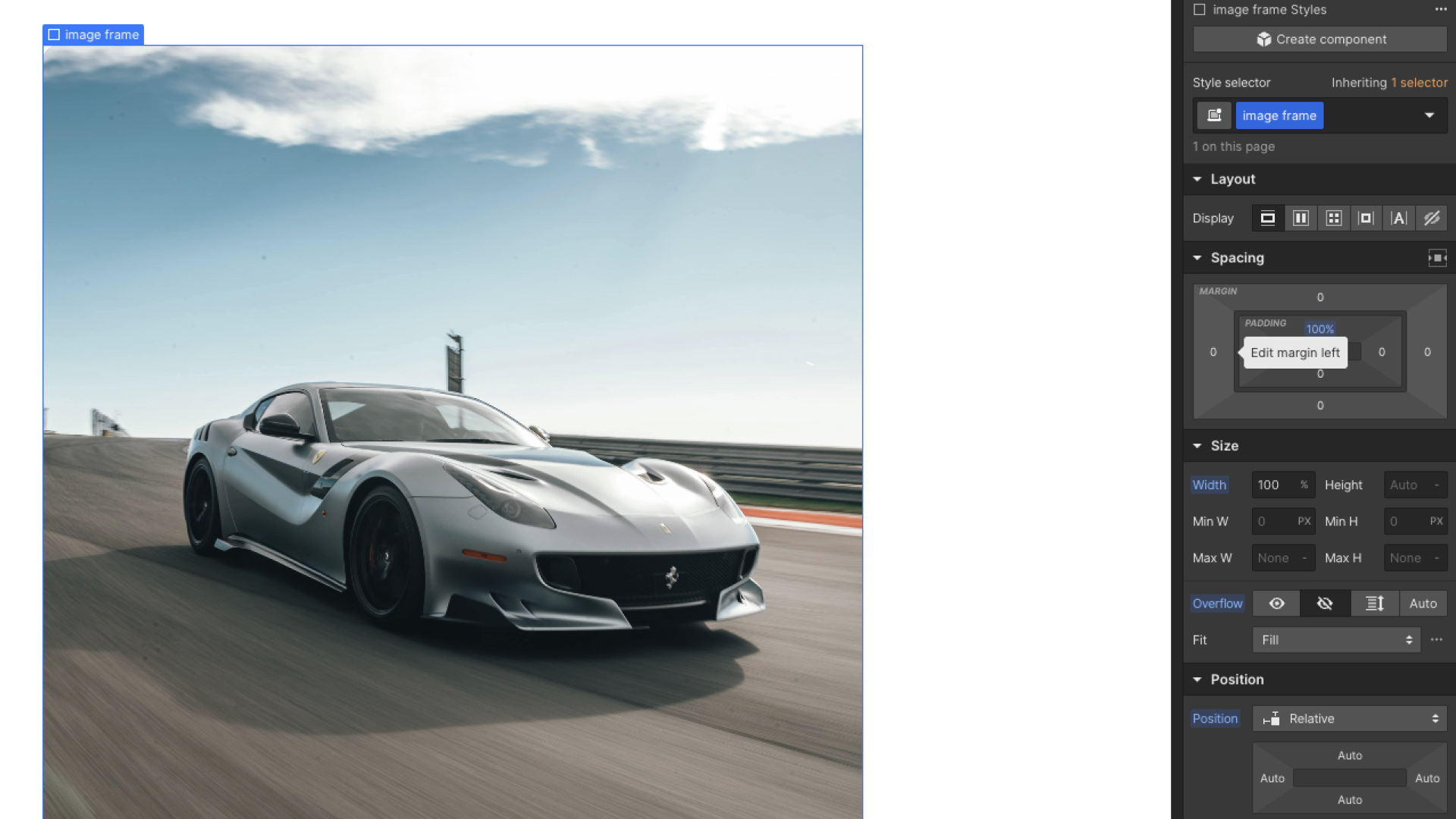
Now, if you put Webflow into preview mode and try resizing your browser window, you’ll notice that your image will maintain a perfect 1:1 aspect ratio.
Various aspect ratios and the required padding
Below is a quick diagram of the various aspect ratios and the top padding required for each one.
- 1:1 aspect ratio: 100% padding top
- 4:3 aspect ratio: 75% padding top
- 3:2 aspect ratio: 66.67% padding top
- 16:9 aspect ratio: 56.25% padding top
What’s cool about using this method is that if you ever wanted to get fancy and do interactions where when you hover over the image, the image will zoom in and other cool effects like that, everything is already perfectly set up since we already have the image frame in place.
.png)
Schedule a 1-on-1 Webflow consulting call with a vetted expert.
